John Denver: Next Billion Users
- UX Design
- UX Research
A while ago, I stumbled across Google’s research on internet’s next billion users. Each day, millions of people around the world discover Internet for the first time. They may be youngsters who know their way about technology, and will easily learn into our new, complex designs, motions and interactions, and it might all come natural to them.
But they aren’t the only new users that come up. They might be older individuals, who aren’t as comfortable with tech as the previous category. They might be looking at technology suspiciously, like it’s taking away an important part of their lives (and they wouldn’t be wrong). They might be overwhelmed by its flamboyance, causing confusion, and error.
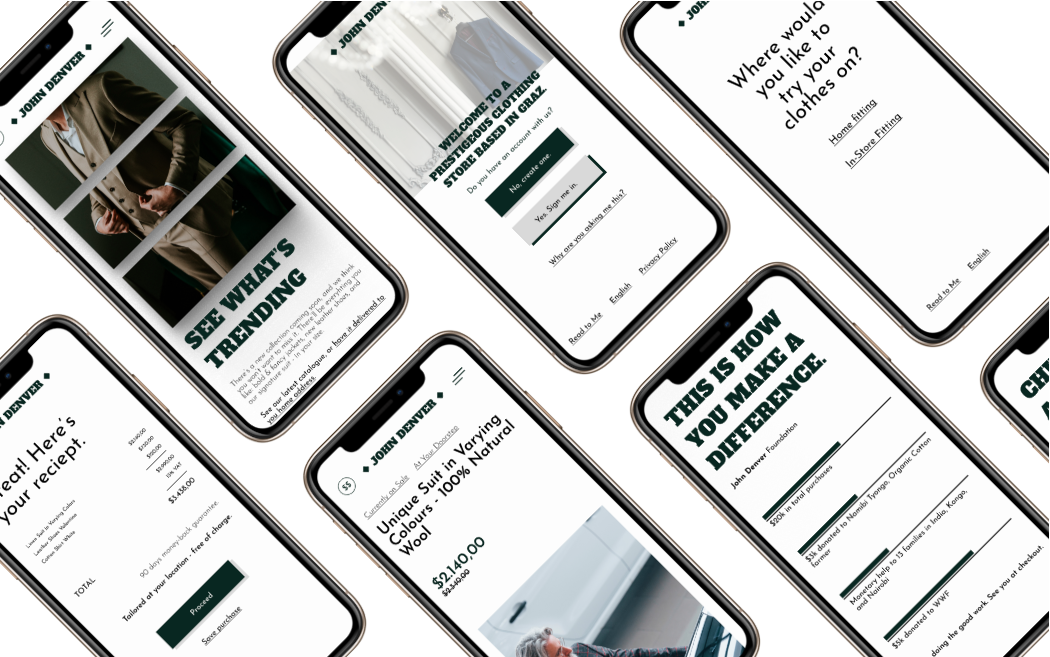
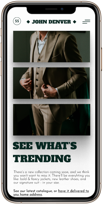
And with the latter one billion users in mind was the John Denver project designed. A store that would sell men’s luxurious suits, made for everybody.

What do they like? What do they miss?
In most European countries, online shopping is already in full sway. People enjoy buying things online, as much, or more, than actually going to the store. But in this part of the world, things aren’t quite the same. Why?
I interviewed 7 participants over the age of 40 who had little to no experience in shopping online (they have never purchased a product, but they know that items could be obtained online). I asked them about their thoughts and feelings when they go suit-shopping. Most of them were quite positive, and made the relation of buying a suit, with a generally favorable experience of inter-personal exchange.
Bottom line, they go to a store, they are served by the staff, they fit the suit, they talk with the staff, and they hear of something that they haven’t heard of before; they loved its eventfulness.
When I asked them about the same thing, but online, they had generally unfavorable responses.
“Yeah, I mean, sure, maybe it’s easier to some people… But I just can’t seem to find the right thing.”
“It’s just all too much
for me, to be honest.”
“Difficult. I have to ask my son to help me. He’s not really happy about that.”

Remedy the Difficult
The research pointed out to two things: one, people wish the store be easy to use, and two, they want the purchase to feel eventful. These two problems actualy have intertwining solutions.
Yes, people in general don’t want many
options. They want enough, well disributed options. But in this particular case, I thought they wanted only enough options at the right time in the purchase journey. So, each screen, as in a game, would be an equivalent of the in-store
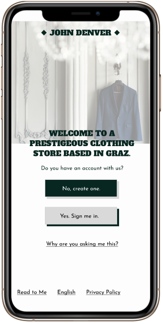
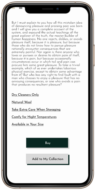
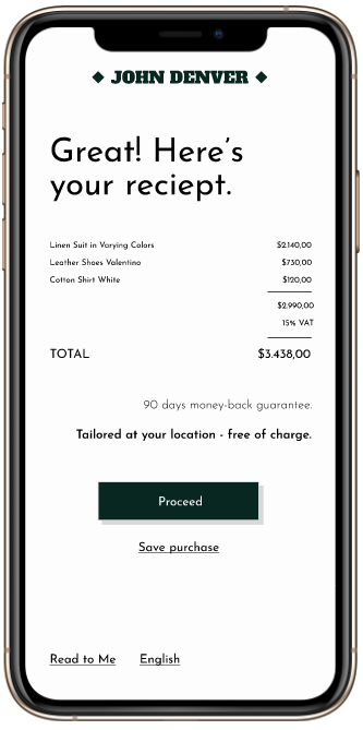
exchange. A member of the staff could ask - where do you want your suit to be fitted? At your location, or here, in store? And the user would give an aswer. In that manner, steps are kept simple and straightforward, resembeling a dialogue.
There’s something happening.
Many different industries try to solve this problem in various ways. One of the ways is actually making an event, albeit an online one, of shopping online. It would have a scheduled time, date, people invited, and so on. But this
would be inefficient for many reasons. There’s a trouble that the online event would be further difficult to use for the new users, and firthermore, they could be very disappointed by lack of emotion it provides, as opposed to their usual
routine.
So, the “something happening” had to be something greater, but also something more discreet.
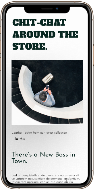
Firstly, bits and pieces of content are placed across the app, representing the chit-chat going about the store. It reduces the overwhelming experience users complained about facing, and gives the store a more natural, human touch.
It could be completely ignored - just as a staff member commenting on a suit could be - but it could provide valuable input.
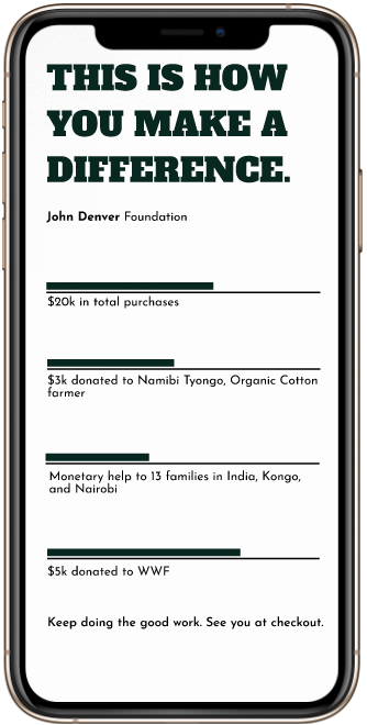
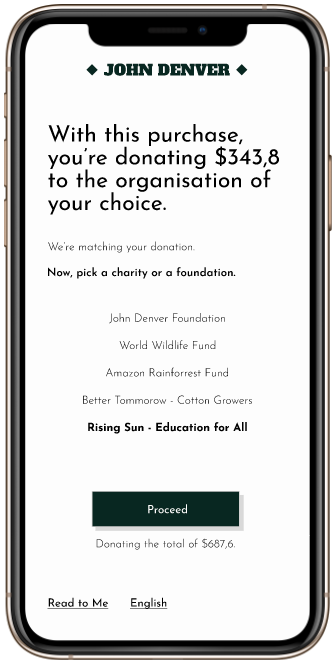
More importantly, an act of shopping online should also be an act of charity, that a user would be updated on, as the time progresses. The user could choose the charity and see what the company would donate based on their purchase.
On the homepage and on the user’s profile, the user could always see the amount that’s been donated in their name, and how their donations helped shape a better world.
A simple checkout process, led step by step, allows users to really feel they have the power over technology and furthermore resembles a dialogue form a customer would have with, for example, a cashier.
Empathy and equity, for me, are the most important parts of designing a good user experience. Without equitable designs, we unkowingly, but rapidly, design products that actively marginalize groups that are already marginized in an online space. And even though this change is a slow process, it is happening, and soon enough we will have equitable designs helping not only marginalized and underrepresented social groups, but everyone as well.