Sawyer - Gallery e-commerce app
- In progress
- UX Design
- UX Research
- Google UXD Certificate
Buying art online? What is that like? Is there a difference between buying art in galleries, and adding it to an online cart? Better, or worse? Can we make that experience as entertaining, amusing, and fulfilling, but less exhausting, overwhelming, and frustrating, as the one we get when we go to a gallery?
As a part of Google UX Design Certification program, I got a task to create an e-commerce app for an art gallery. So, on this on-going project I completed following stages:
Foundational research, including user interviews, creating user personas, empathy maps, and user journeys, with competitive audit at the stage’s end;
Ideating the solution for a defined problem;
Developing a working, low-fidelity prototype;
Test the prototype in an unmoderated usability study;
Iterate the design before turining them in high-fidelity prototypes
Research
As a part of my foundational research, I interviewed six adults, living in, or on the outskirts of a big city. They had to be interested in acquiring art, but it was important that they mustn’t have a formal art education. I conducted user interviews,
created empathy maps and personas to better understand users I’m designing for. In my research, I’ve discovered two equally important user groups: younger adults, who have no formal knowledge of art, but have picked up the interest recently.
However, they have no means to learn more about contemporary aesthetics, and feel unwelcome in most galleries, especially if they’re persons of color.
The other group of users feels discomfort when shopping for art online. They used to visit galleries frequently, but lack the time lately. They also feel like they can’t keep up with modern trends, but strongly dislike how some
galleries present the art online, reducing it to a commodity.
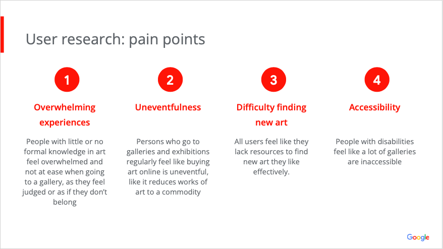
And so, discovered pain points could be divided into four categories:
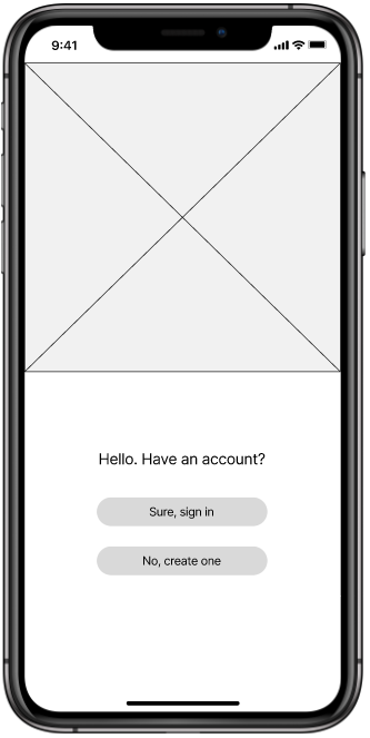
First iteration: Wireframes
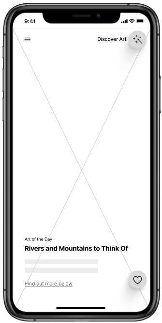
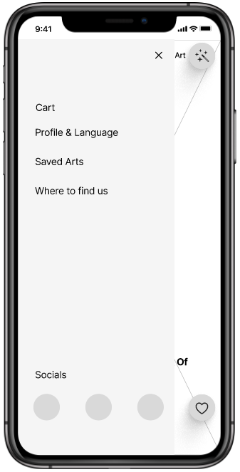
To solve identified pain points, app was designed to have three major parts that will help users both buy and discover the field of art:
Risign stars - Interviews with new and noteworthy authors, especially from historically underrepresented groups.
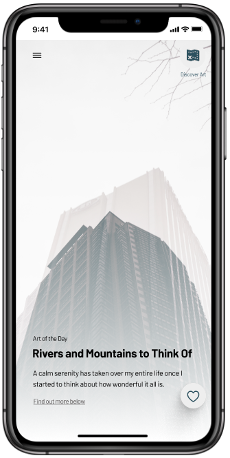
Art of the Day - an art piece featured each day. Users could purchase it, or just find out more about the particular piece. This way, users would make a more informed choice as opposed to going to an art gallery.
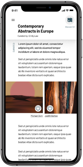
Curated - Section devoted to curated exhibions - similar to real, on-site exhibitions. Users could find out more about contemporary art trends and their relations to present conditions.
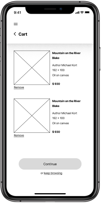
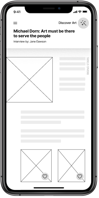
Round One of Testing
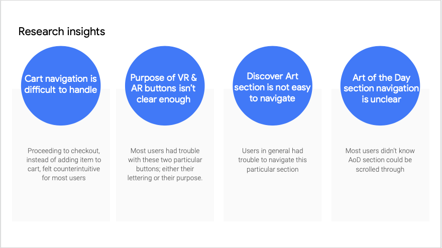
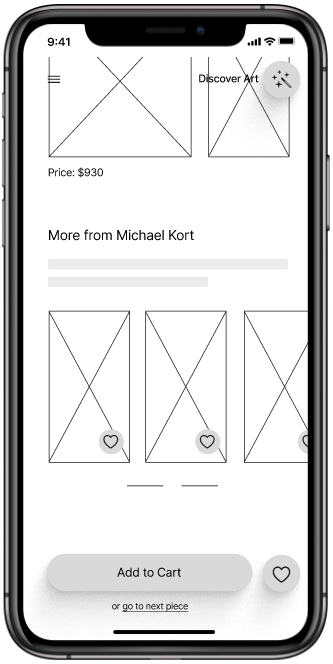
I gained valuable insights from an unmodaretd usability study. Although all participants were happy to use the app, and would use it in the future (good news), not all parts of the app were equally accessible. There were some issues with navigation and
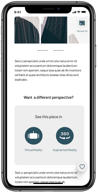
usability, and some sections were unclear. For example, users were unsure of the bying flow, didn't know where they were within the Discover Art section, and felt VR & AR buttons were difficult to read.
So, iterate.
Second Iteration: Refining the design
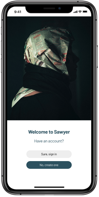
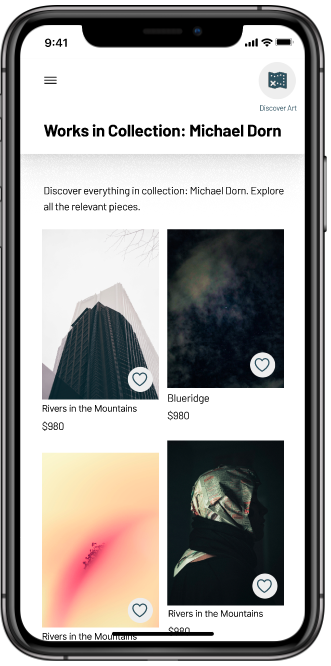
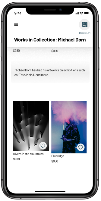
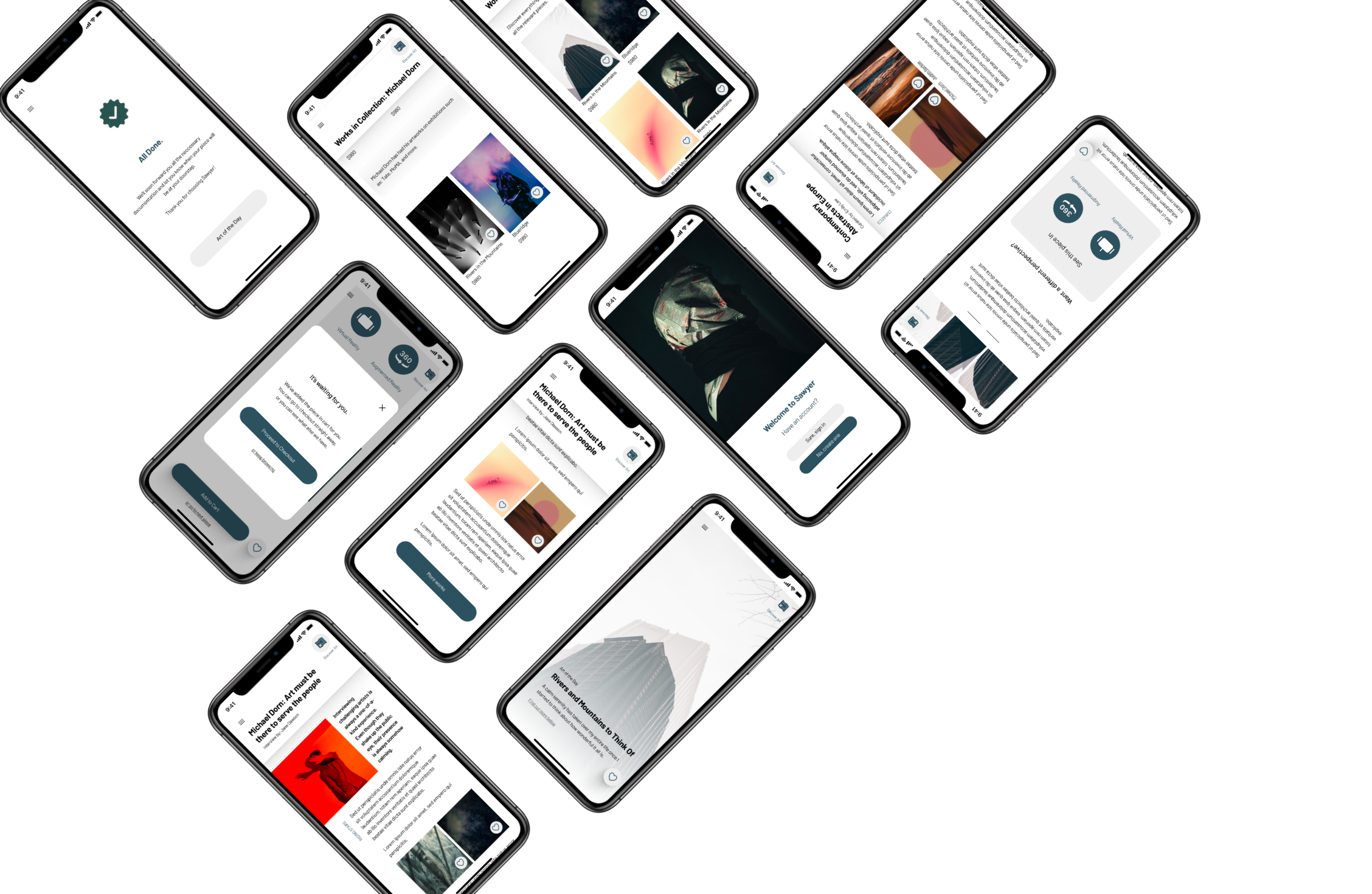
After changing the design in accordance with the research findings, I went further and added iconography, typography, and imagery. I further reflected upon some design principles and made way to a more polished designs.
